If your ecommerce site isn’t mobile-friendly or mobile-optimised, you’re missing out. This post goes over some of the reasons you really should go mobile by now, what types of “going mobile” there are, and how to check up on your mobile-friendliness.
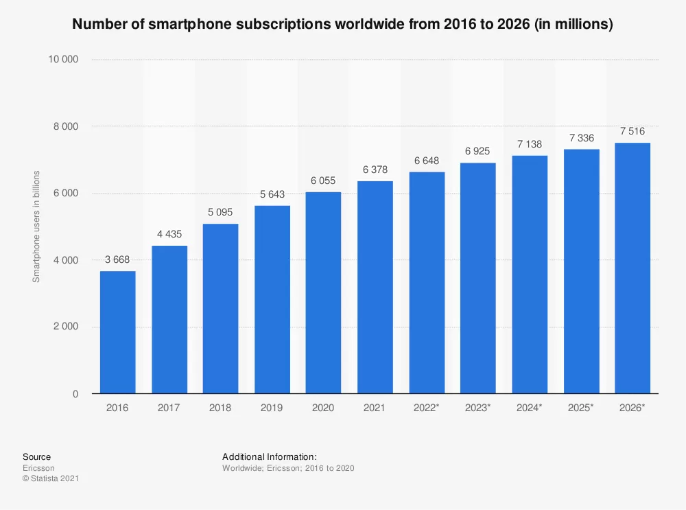
Mobile-friendly or, in other words, able-to-be-easily-used-with-a-smartphone-or-tablet, is becoming standard for most websites. That’s because people are using their phones on the internet more and more. We’re checking emails, posting on social media, watching videos, trying to see if we’ll catch the next train and shopping.
This is happening for a few reasons. People are getting more comfortable paying for things on their phones, we’re keeping our mobile phones with us at all times, and the technology is now available to make mobile sales fast, straightforward and secure.
Customers are fickle friends. They might, for example, see something they like on your desktop ecommerce store but want to sleep on it before buying. The next day, they’re waiting in line at the supermarket and ready to buy from their phone. If it’s not easy for them to find what they want and check out before they get to the front of the queue, they could be a lost customer.
Get where your ecommerce customers are.
This should be your business mantra. It’s why you use social media, it’s why you’re targeted about where you advertise. And guess what? People are on their phones. Constantly. So much so that we’re using them to make purchases at higher rates than with our computers. There’s only so many times you can tell your boss you’re working from your work desk when you’re shopping for shoes. They’ll get suspicious.

What’s the Difference Between Mobile-Friendly and Mobile-Optimised?
Mobile-friendly means taking your desktop website and changing the sizes of the boxes, images and text on it to be easily seen on a phone screen.
Mobile-optimised means changing the content to be more appealing to mobile users. That can mean doing things like:
- Focus on visuals – making the landing pages and major content more based on images and video rather than text.
- Reformat navigation buttons to be larger and thumb-friendly
- Make the call to action clearer. People who are on their phones are on the go, so shortening the time it takes for them to get what it is you do and what it is you want them to do is a must.
- Cut the fat. Desktop landing pages are more complex because they have the space. Mobile optimisation means cutting down and only showing what you need to.
A New Ballgame: Responsive Design
There’s a relatively new capacity for mobile, called “responsive design websites”. This means your website from the beginning is designed in a way that automatically adjusts based on the size of the screen it’s being displayed on.
When you choose a Shopify Theme, take a look first at the “responsive” ones. These responsive website themes will automatically be mobile-friendlier than others. (P.S. Here’s a shortlist)
There’s no reason not to do it
Every Shopify theme comes with a mobile-friendly pair. When you activate your mobile site, customers can check out with a shopping cart and see your products with all of the images and descriptions you’ve already set up.
There are a few things you should do though.
1. Do a full check-up to make sure things are working the way they should be. Grab your own smartphone and do the following:
- Make a purchase with several things products in the cart
- Test a coupon
- Test out your contact page, fill in your details, and see if you receive an email like you should
- Check out how well your product images zoom and pop out, and if they are a bit clunky or if they stay well in their spots
- Go to every page and see if they load quickly, and if everything is in the right place
- Try out your mobile site on different browsers like Chrome and Safari
2. Check in with Google
Use the Google Mobile-Friendly Checker to see how friendly it is, according to SEO searches.
3. Make your social media linked
Mobile users are also on Facebook, Instagram, Twitter and Pinterest. Make sure your business social media pages are working well, easy to find, and encouraged to visit.
Put Your Mobile To Work
You can do things like send targeted emails to people who bought from their phones, run mobile marketing campaigns through Instagram and other phone-only sites, or test out ads to run on your mobile site. Make sure you’re keeping up with your data to see how well they’re working, through Google Analytics.
For more articles to help your e-commerce success follow the link.


