There is no point in trying to deliver the highest profits from hyper-personalisation if the email stylesheet design being used has not been scientifically analysed and tested fully first.
In this article, we detail how our stylesheet design came about, together with the depth of the analysis, and both the quality and quantity of that test.
Predictive personalisation software (PPS) delivers the highest gross profit in marketing ROI today. Verified by leading research institutes McKinsey, Statista, Forrester and Bain the returns from hyper-personalisation are 20x (twenty times) that of standard email marketing, omnichannel marketing and social-media marketing combined. Having an established stylesheet layout to populate is therefore a necessity. The distinction between the top 30 vendors is considerable.
The time it takes to create your email design (stylesheet) is an enormous deficit before you begin, not least because of human involvement, and therefore your highest cost (staff). Consider how much your staff cost.
Such is the volume of data being processed that being able to populate a standard layout becomes essential. Further, it avoids the errors and omissions, together with mis-targeting and inaccuracies associated with human involvement. Exclamations of frustration at not being able to change it are put aside as soon as the returns are established.
No matter how attractive, interesting, attention-grabbing etc promo emails are, the enormous volume of additional sales delivered by hyper-personalisation software negates all the irritations about the inability to design it. After all, it needs to be able to implement product selections in nano-seconds, and total autonomous solutions highest ROI in marketing and the phenomenal ROI dictate that the necessity is justified.
How Stylesheets Work
To maximise the sales potential from every email, each product selected is personal to the consumer receiving it, curated in nano-seconds before it is sent. The data-mining on the servers is enormous, to deliver the maximum benefit to the retailer and more importantly the consumer.
Each consumer only ever sees products that they are most likely to buy. Their buying history and impressions detailing that individual’s interest in them.
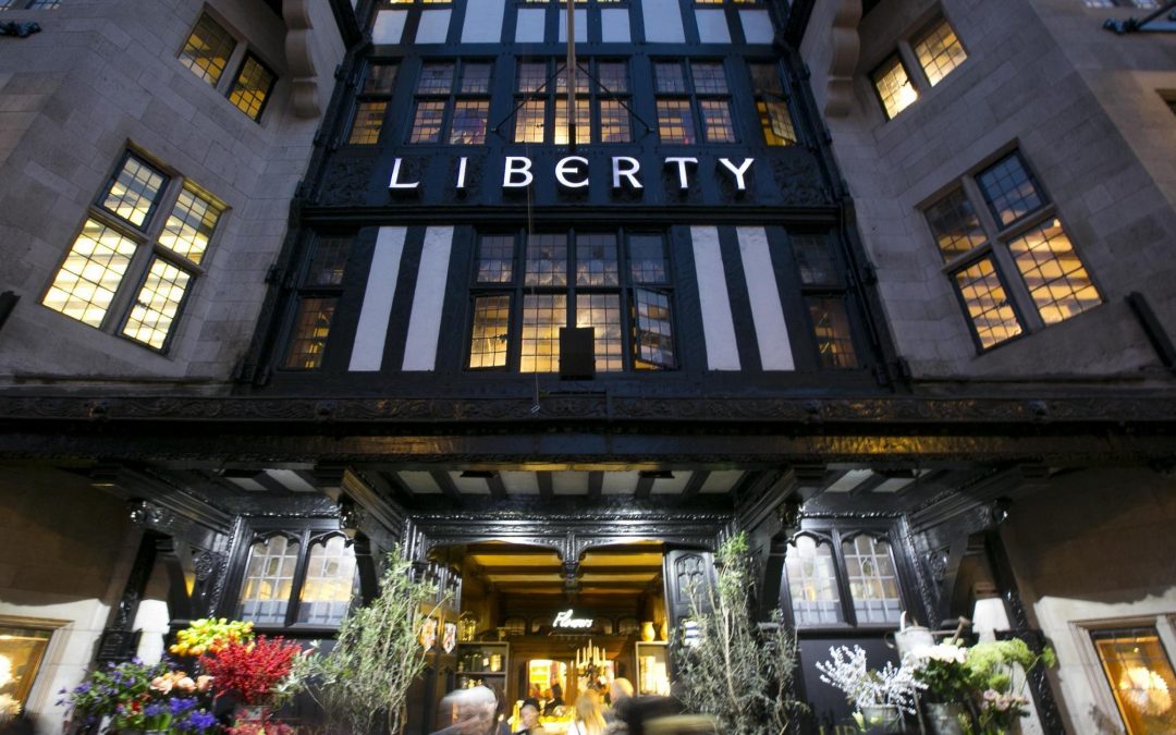
Our PPS stylesheet was tested across multiple national brands over 10 years. They included Liberty, NEXT, The White Company, Fatface and Snow & Rock. The stylesheet designs, perpetually improved and perfected, originally came from an amalgamation of contributions from highly respected agencies including BBH, JWT now Wundermanthomson, Saatchi’s, McCann, WPP and Grey.
The stylesheet design was perpetually improved throughout the decade. Time was not wasted; often the sales, were phenomenal for each of the respective clients, in billions of pounds of revenue. The success of one client was able to be shared with the others.
Today’s A – B testing of stylesheet design and layout, mirrors the thousands of designs tested, across the calendar, hour – time of day, product and client. Across the desk came the results, the newest one was always perceived as the ‘new great hope’, and at first it sometimes was, but without exception only to fall at the last.
One stylesheet design always outperformed the rest. Whenever it was used, in whatever guise, it won, nothing came close. Indeed its next nearest rival only performed half as well, if it was lucky, in over ten years of testing, and billions of emails sent.
Even small changes are toxic
The simplest way to illustrate the effect of changing the stylesheet design is to consider it as having the effect illustrated in the graph below. In a nutshell, alternatives are toxic. The effect is always a negative one.
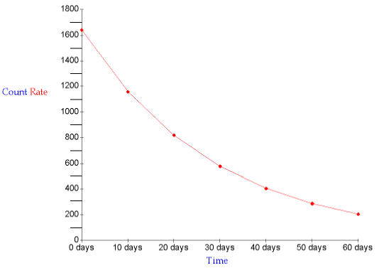
The highest point, on the left-hand side of the graph, is the maximum profits achieved, by the highest-performing stylesheet. Significantly we got to the point that any change whatsoever, without exception, moved the ROI somewhere to the right. In other words a lower return, further down the slope, some more dramatically than others.
You can appreciate why our clients prefer not to change it. Sometimes new clients say things like “But our house style reflects our personality, we need to be able to change it”. But when you consider that the images used are from their website, they already have the house style. The point of personalised product selection software is to not confuse the consumer with anything other than a clinical focus on the products they have looked at. To this end, a distinction between promotional email and product email is therefore an asset.
Achieving the ultimate success
This PPS stylesheet is simplicity itself for each consumer; an automatic personalised, product selection, marketing email. It has earned its place with verifiable provenance.
ESPs encourage the ability to change and create layout and design. We applaud that for promotional and marketing emails as we commonly run alongside them, but then we set about delivering far greater ROI. The PPS process has so much data processing that it necessitates static parameters. However, because the ROI is so huge the benefits far outweigh the concern.
We offer substantiation of returns in our case-studies and include client testimonies to verify. Many of our existing clients are happy and willing to take calls on our behalf too.
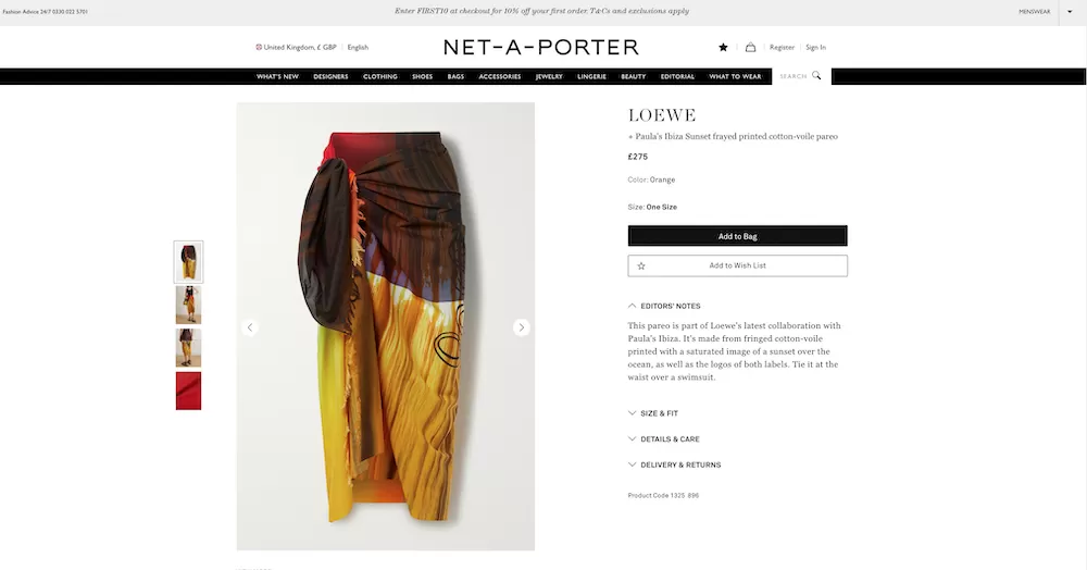
Here is the stylesheet we use:

We do allow our customers to hyper-personalise their stylesheet should they wish. But by far the majority appreciate if someone else has already done this much work, tested and better tested it, and found no greater champion for delivering such massive turnover, why mess with it?
SwiftERM is installed as a plugin on your site. Simply complete the registration form which takes you to your platform’s site where you can select the version appropriate for you.
SwiftERM is a Microsoft Partner company.



One Response
Good times. Thanks David.