A few years ago, David Weinberger, a technologist and co-author of The Cluetrain Manifesto, wrote, “Personalisation: the automatic tailoring of sites and messages to the individuals viewing them so that we can feel that somewhere there’s a piece of software that loves us for who we are.”
Two decades later, ironically, personalisation is being used by companies attempting to make the online experience more human.
Personalisation has grown rapidly since Weinburger’s statement. So much so that personalised experiences have become the norm, not an option.
But is personalisation the key to a better user experience? Does it impact conversion rates?
What is web personalisation?
“Personalisation” is rather self-explanatory, but more complex than it’s given credit for. For example, you could be dealing with different channels (on-site, in-app, mobile web, and so on). Essentially, it’s the real-time individualisation of a site to suit each visitor’s unique needs and guide them through a custom conversion.
Here’s an example of on-site personalisation from Bunting. Visitor 1 is a woman from the USA, who is browsing in June or July…
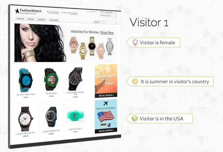

Visitor 2 is a man from the UK who has browsed Nixon watches before, but never purchased. He is visiting the same site (not a separate landing page)…
Notice how the two pages are different based on either the visitor’s demographic or previous behaviour? That’s on-site (segmenting) personalisation in action.
Why is this relevant? People are drowning in information and options. Personalisation reduces the amount of information and the number of options to help guide visitors through a funnel that’s designed just for them and their individual needs.
So, how do marketers feel when it comes to personalisation? According to a survey by Evergage, an overwhelming 98% of marketers believe that personalisation advances customer relationships. Indeed this is supported by empirical evidence now.
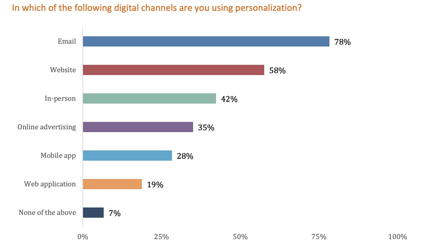
When it comes to using personalisation, this is the current channel breakdown:
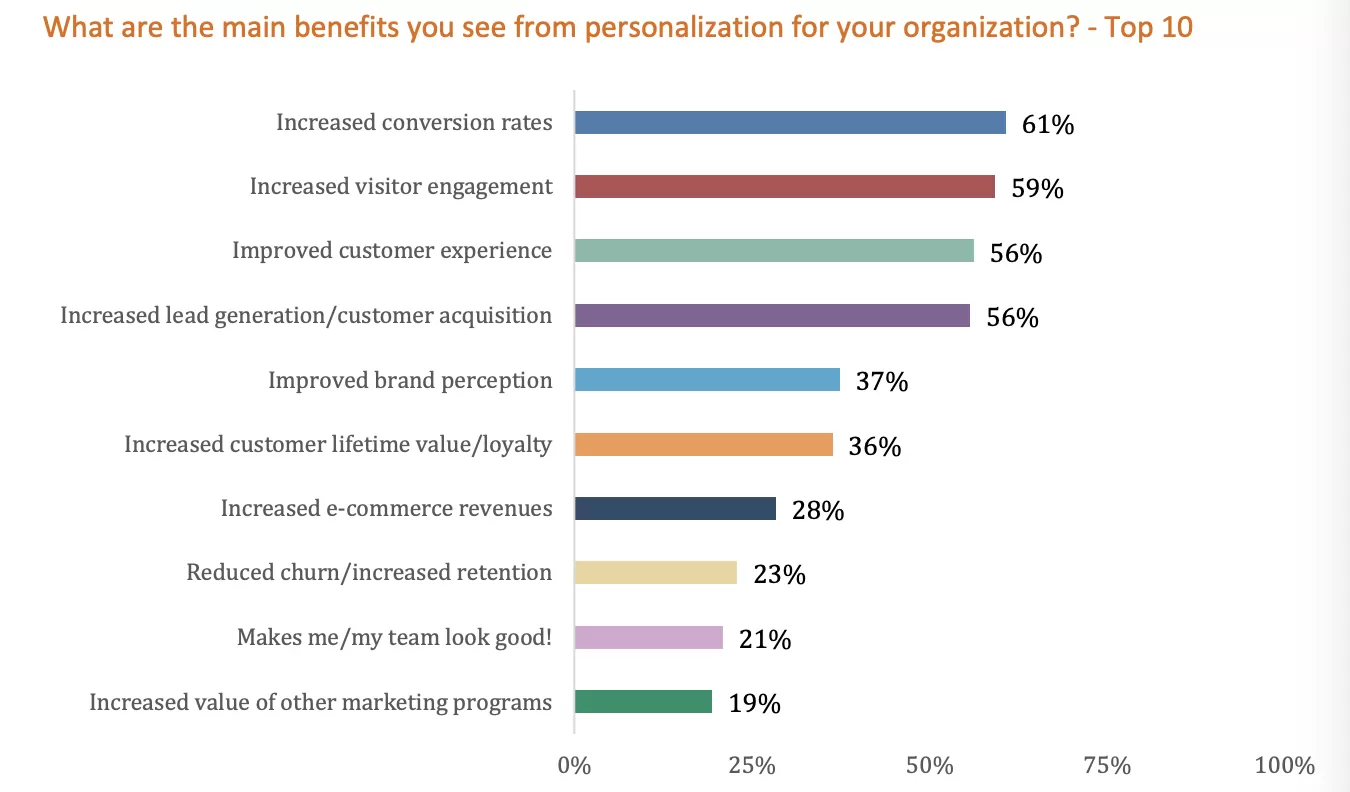
Conversion rate is the main measure of personalisation success…
The hypothesis is that the more personalised the site/user experience, the more likely visitors are to convert.
So, how exactly are marketers personalising their sites?
Popups, information bars, call-outs—nothing you haven’t seen before. In-line content and edits are at least holding their own, but there hasn’t been much innovation in the space when it comes to “types of personalised web experiences.”
Personalisation is powered by big data, which means you have a lot of options when choosing how to segment your audience for personalisation purposes. With your go-to marketing, SwiftERM now personalises every product selection to the individual consumer receiving it, with zero segmentation necessary. It complements marketing and promotional email campaigns, out-performing them multiple times over, including rule-based segmentation.
Evergage’s data from a few years ago revealed that many marketers rely on elements such as device, geolocation, and content viewed as personalisation criteria. Fresh data revealed and added to that list campaign source, email opens and clickthroughs, purchased products, and more:
Customisation vs. personalisation: what’s the difference?
This is a common question: What’s the difference between customisation and personalisation?
Often, you’ll see the two terms being used interchangeably. That’s unfortunate because there is a distinction between the two. Definitions may vary, but to summarise…
- Customisation: The visitor deliberately chooses between options designed to make the user experience more personal.
- Personalisation: The visitor is automatically shown personalised pages based on anticipated needs or wants.
Customisation is the visitor’s conscious decision to alert the user experience. Personalisation is making predictions and automatically altering the user experience based on big data.
Good(ish) example: Netflix
Amazon is an obvious example of personalisation. Their product recommendation engine is often applauded. Instead, let’s look at another big company that’s personalising the user experience well: Netflix.
When you log into my Netflix account, here’s what you see…
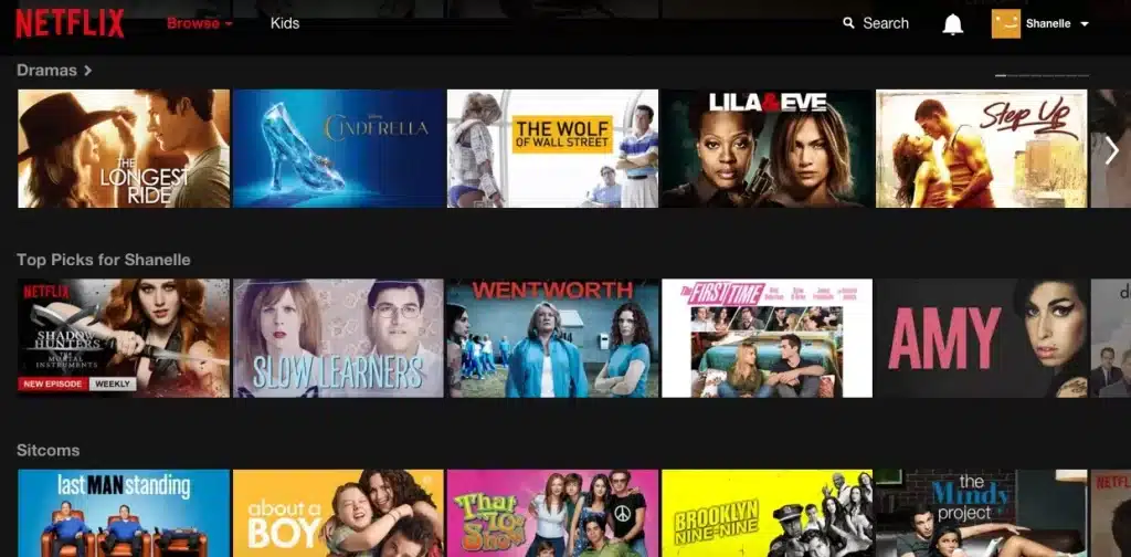
Netflix is predicting, based on viewing history. One thing Netflix could do to improve the user experience (vs. focusing only on showing personalised content) is de-prioritise shows and movies that have been recently watched from their recommendations.
The experience isn’t as personalised as it was before. The system didn’t keep learning.
Recommendations based on what has been recently watched could be based on actors, directors, genre, ratings from people like me, and so on. In this case, a lot of data is being combined to personalise the experience.
A lot more goes into personalisation strategy than most people think. It’s not just popups, call-outs and “product recommendations like Amazon.”
What tools can you use?
When you’re dealing with so much data, you’re going to need a tool to help you out. Here are just a few of the top web hyper-personalisation tools available today, see the link.
Static content vs. dynamic content: which converts better?
The honest answer is a frustrating one: it depends. Perhaps all of your visitors expect/need a similar experience, maybe you personalise the experience with the wrong messaging, maybe you try to personalise it at the wrong time, etc. There’s always the need to test (and optimise) it for yourself on your audience.
However, there is a lot of logic behind the hypothesis that a more personalised, guided experience converts better. There are also quite a few case studies to support it.
Product recommendation case studies from Bunting
We’ve already talked about how Amazon and Netflix do product recommendations, so this should feel familiar. Bunting worked with At Home In The Country to add personalised product recommendations to their site, which resulted in a…
- 13% increase in revenue;
- 3% increase in average visit duration;
- 12.5% increase in conversions;
- 4.5% increase in product views.
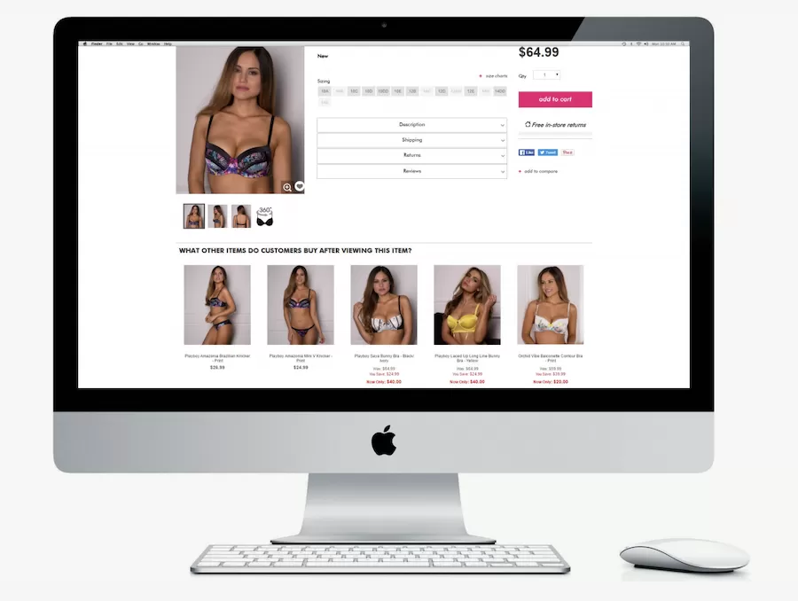
What’s interesting is the use of the word “Buy” in “What other items do customers buy after viewing this item?” Normally, you’d see something like “Customers also viewed…” Buy is much more active, giving the visitor more confidence.
Bunting also helped Bras N Things implement product recommendations, which resulted in …
9.6% increase in average order value;
3.5% increase in average visit duration;
3.3% increase in product views;
2.4% increase in site visits.
Here’s what they did…
Where personalisation goes wrong
While the four case studies above demonstrate that personalisation does work, it’s important to remember that it can go wrong. And when it does, it goes very wrong.
There are two major mistakes marketers make when it comes to personalisation: not truly personalising the experience and segmenting audiences ineffectively.
1. Content vs. experience personalisation
Context is important here.
- Who is this person?
- Have they been here before?
- Have they entered the conversion funnel at all?
- Have they made a purchase before?
- What pages have they read?
- How thoroughly are they reading those pages?
Once context is accounted for, you can focus on intent, motivation and anxiety for that individual visitor.
Instead of stopping at a popup advertising a home equity eBook, go the extra mile to cover the entire experience. Remove distracting sections of the site that are unrelated, simplify the navigation, change images to match their demographic, and so on. There are tons of possibilities.
Understand
Let’s say you’re a distributed startup team frustrated with your web meeting software. You start looking for alternatives and find a viable one, but the UX is a disaster…
They don’t have the same information his existing web meeting software company would. What they do have is his behavioural data, demographic information, and more.
If you combine personalisation and customisation, you can get as granular as switching from Product A, Product B, or Product C to your product.
What’s important here is that you understand:
- Who the visitor is;
- Why the visitor is there;
- Where the visitor is in the buying process.
When you understand that, you can create entire user experiences for very specific segments.
2. Segmenting ineffectively
When you’re segmenting for personalisation, you have options. Here are just a few examples of the type of information you can use to segment your audience…
- Behaviour on any channel (web, email, mobile).
- Demographic information like age, gender, education, ethnicity, marital status, etc.
- Geographic information like city, state/province, country, time of year/season, time of day/day of week.
- First-party data (i.e. data you have collected yourself).
- Third-party data (i.e. data from your CRM or POS).
You aren’t limited whatsoever. This is a big data industry, so take advantage of it instead of sticking to site behaviour, gender, and age.
For example, Nielsen Norman Group found that personalising intranet portals based on the person’s role at the company vs. the person’s previous behaviour is more effective.
You can find a lot of segmentation inspiration in your first-party data. The best way to do that is to go to your Google Analytics account and begin segmenting your data as you normally would. What segments are you using?
Some examples include…
- Browser / Device type. How would you change the UX for an Android visitor? Or someone who uses IE 9?
- Page load time. Should you treat visitors who waited longer for your site to load the same way?
- Day of week / Time of day. Does someone browsing your site at 3 a.m. on a Friday have different motivations, intentions, and anxieties than someone browsing your site at 1 p.m. on a Monday?
- Conversion funnels. Where do people drop out of your funnel most often? Combine the quantitative data with heuristic analysis. Why are people dropping out? What is so difficult about this step in particular? How can personalisation fix it?
- Landing page type. Are you dealing with someone who is on your main site or a dedicated landing page?
- A/B test variation. If you’re running A/B tests, visitors who land on variation A will have a slightly different experience than visitors who land on variation B, right?
- New vs. returning visitors. Will someone who has visited your site three times in the last 24 hours have different motivations, intentions, and anxieties than someone who has just landed on your site for the first time?
Use your existing data to inform your personalisation efforts. It’ll show you problem pages and the parts of your conversion funnel that need work, which is where you should begin.
Conclusion
Most marketers have personalised content, not a personalised UX.
It’s the shift in thinking that you need if you want to take full advantage of personalisation. Marketers need to be more creative than deploying a popup when exit intention is shown or when a cart is abandoned.
Here’s a simple process you can use to excel at web personalisation…
- Set your goal and choose your KPIs.
- Conduct qualitative research. How do your “power users” use your site? How do new users? Personalisation can bridge the gap there.
- Conduct quantitative research. What part of your funnel is dropping out most often? Start there.
- Choose your segments and conduct additional research to understand their motivations, intentions, anxieties, habits, etc.
- Design entire UXs for each segment. Eliminate distractions, simplify navigations, update creative and copy, etc.
- Choose a personalisation tool and deploy your strategy.
- Think outside the box to come up with creative hypotheses to test. Rarely will your original UXs be the best available options. Always be tweaking and optimising for the best results.


