Cart abandonment refers to visitors who add items to their online shopping cart, but exit without completing the purchase. The Baymard Report highlights some of the main reasons for people abandoning a purchase at the shopping cart. We address the causes of cart abandonment and apply established principles from the science of consumer behaviour.
1. Remove Hidden Costs
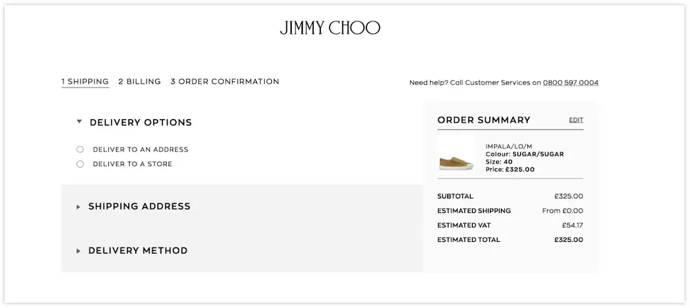
How much are your customers being charged for shipping and tax? One of the main reasons for cart abandonment is shipping costs. If your customers are paying £20 for a T-shirt, they’re unlikely to add another £4.99 for shipping.
And, if they clicked on an item that looked like a bargain, adding tax later would break their trust! One of the best ways to reduce shipping-cost-related abandonment is to show your customers the full price, and how it breaks down before they get to the Shopping Cart.
There are a few other things you can do immediately…
- Add an order target and throw in free shipping when your customer reaches it.
- Include the shipping cost within the item price. A $20 T-shirt with $4.99 delivery feels like a cheap purchase with expensive hidden costs, whereas a $24.99 T-shirt with Free delivery feels like a mid-range purchase with something extra free.
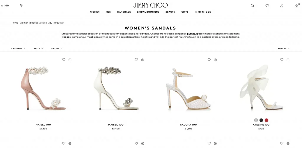
An advanced option is to identify your visitor’s location and then offer location-specific delivery information. Luxury brands use this strategy to reduce their cart abandonment rate.

By automatically configuring the user’s location, Jimmy Choo avoids unnecessary pain at the checkout.

An easy way to make use of your user’s location is to use Google Tag Manager to set up a location-based cookie and then apply dynamic text to your page.
Alternatively, there are Shopify apps and ecommerce tools that help you apply geolocation and personalise your website.
2. Make Your Checkout Simpler to Reduce Friction
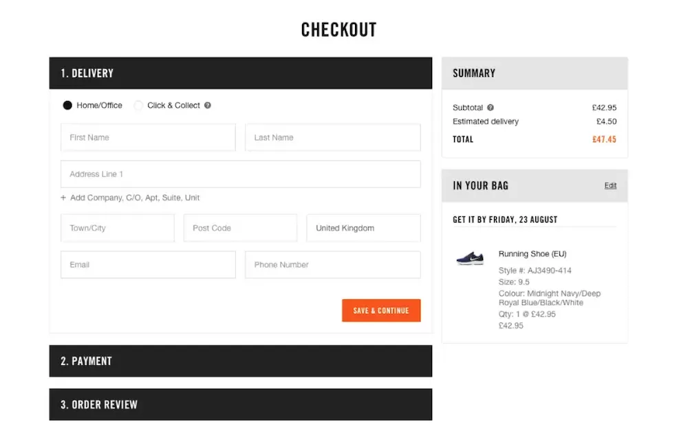
The design of Checkout Pages is another common reason for cart abandonment. There are plenty of case studies showing how large eCommerce companies can increase conversion rates by around 30% simply by optimising their checkout.
The best policy is a test-and-learn approach to optimising your pages. However, some principles seem to hold true:
- Requiring fewer fields is usually better
- A simple interface reduces anxiety
- Trust signs are essential (including an SSL certificate)
- Progress bars, summaries and field anchors make a page easier to use
Doubt, confusion and difficulty are all forms of “Friction“, the resistance that prevents customers from completing a process. When a user is presented with one of these kinds of obstacles, they will often simply give up.

3. Reduce Distraction and Address Doubts
The internet is a world of seemingly infinite options. In these circumstances, it’s hard to commit to a single option. However, if you can stop people from wondering what else is available, or worrying about a small feature, it should reduce your cart abandonment rate.
There are a few easy ways to address any doubts your customers have. This process starts from the first interaction you have with a customer…Offer generous warranties and highlight your returns policy
- Show customer ratings, reviews and testimonials
- Use surveys to identify what your customers want, then explain how you can give it to them

4. Reinforce a Selection With Consumer Psychology
Several simple psychological effects make a customer feel attached to a particular item. By engineering your sales process to encourage this connection, you can reduce your cart abandonment rate more effectively. Our article on cognitive dissonance refers.
Trigger Loss aversion
In a 1981 paper published in the Quarterly Journal of Economics, the psychologists Daniel Kahneman and Amos Tversky highlighted an irrational bias that has a significant effect on most financial transactions. The paper “Loss Aversion in Risk-less Choice” suggested that the experience of losing something is about twice as powerful as the experience of gaining the same amount.
This is one reason why so many products come with a free trial. Having to give something up, when the trial ends, feels more significant than the possibility of gaining something for the same price.
So, how can you use loss aversion before a customer has made a purchase?
Even the language you use can make customers feel like they own your products. Instead of describing “some oranges” or just “shopping cart”, describe them as “your oranges” and “your cart” to foster an emotional connection.
Use Implicit Egotism
In the mid-1980s, psychologists began to study people’s instinctive preference for names, places and things that match their own identities. For example, most people have a bias towards those of the same age, gender and social position as themselves. People also gravitate to information that is “salient” (things that apply to them and their situation). Viewers often prefer to watch local news, even though the stories may not affect them any more than national news.
In 2002, this effect was given the name “Implicit Egotism” in a paper published in the Journal of Personality and Social Psychology.
A powerful way to use the Egotism effect is to augment the online customer experience with personalised features, such as personalised product recommendations “people who bought this also bought…” (you can easily add these to an ecommerce site with a WooCommerce or Shopify Plugin.)
- Retargeting emails and push notifications. These can be tailored to your user’s preferences in a way that helps to earn their trust.
Provide Choice Closure
Between adding an item to their basket and paying for it, most consumers experience some degree of anxiety about their choice. This uncertainty can even lead to cart abandonment. One way to avoid this is to provide Choice Closure.
A 2013 study by Botti and Faro at the London Business School showed that the simple “Acts of Closure” (such as closing a menu after making a decision) increased their subjects’ overall satisfaction with their choices.
A simple way to recreate “Acts of Closure” online is to reassure customers they have made a good choice with a positive Add-to-Cart message. This is most effective if you combine it with an element of Social Proof.
Apply Social Proof
Social Proof occurs when our decisions are shaped by the choices and behaviour of those around us. Because it is so difficult to prove how good your products are without a customer seeing them, Social Proof marketing has become an essential part of eCommerce:
- Star ratings
- Customer reviews
- Expert endorsements
However, most of these are only used on product pages. By adding different kinds of Social Proof to your basket and checkout pages, you can reassure customers that they are making the right choice.
The most immediate solution is AI hyper-personalisation software for ecommerce email marketing, for each consumer. It presents perfectly chosen products at exactly the right moment, unique to each consumer without segmentation. It truly annihilates not only cart abandonment but also the rate of returns.


